Report
Motivation
Scientific evidence has shown that being happy will bring positive effects on people’s both mental and physical health. Staying happy promotes a person to keep a healthy lifestyle. Mentally, happiness helps people conquer stress and relieve pressure. Physically, being happy boosts people’s immune system, protect their heart, and overall reduce potential pain. Happiness may even increase people’s life expectancy.
From a nationwide perspective, happier citizens may have better work performance and more supportive social relationships. Specifically, if employees are satisfied with what they do and feel happy about their daily jobs, they are more likely to stay long in their positions. As the turnover rate decreases, the labor cost of companies will decrease and ultimately companies will have more money to hire more employees or expand their business. If couples feel happier staying with each other, they are less likely to get divorced. Numerous studies have shown that stable marriages are associated with a low risk of diseases, ranging from diabetes to cardiovascular and respiratory issues. Supportive social relationships also help citizens to live longer and work more effectively.
After realizing the importance of happiness, we decided to analyze what affects happiness and in what way can we increase the overall happiness level.
Initial Questions
Through the early stage of our study, we came up with a few questions based on the 2021 world happiness report. These questions guided us to analyze data, explore findings, and organize results. These questions are listed below.
- Which country has the highest happiness score and which country has the lowest?
- How is happiness distributed in the world?
- What factors affect happiness score and happiness distribution?
- What can governments do to increase happiness level?
Data Source
All the data are downloaded from World Happiness Report:
- Happiness Data: Data Panel
This dataset contains 1949 observations of happiness score and related social factors. The data are sourced from 166 different countries or regions covering years from 2005 to 2020. The GDP variables are provided by World Development Indicators (WDI) and healthy life expectancies are extracted from World Health Organization’s (WHO) Global Health Observatory data repository. All the other factors are gather from the survey of Gallup World Poll.
Data Cleaning
happy_df = readxl::read_xls('DataPanelWHR2021C2.xls') %>%
  janitor::clean_names() %>%
  rename("happiness_score"= life_ladder) %>%
  mutate(
    country_continent = countrycode(country_name, "country.name", "continent")
  ) %>%
  relocate(country_continent)
We Used janitor::clean_names to clean the data names. To clearly know which continent each country belongs to, we used countrycode function to add a continent column. In order use plotly map to show the world happiness score in each country, it is necessary to change the full name of the English country to the ISO3 abbreviation form, which is the three-letter abbreviation form of the country name. Therefore, we downloaded the package countrycode to help us do the transformation. The resulting data file of happy_iso3 contains a single dataframe with 1931 rows of data on 12 variables. The detailed information about each variables is listed in following section.
Data Description
country_code: country name in iso3 code format.country_name: country name in country name (English) format.year: the year of the measurements on that row.life_ladder: happiness score.log_gdp_per_capita: the statistics of GDP per capita in purchasing power parity.social_support: national average of social support data.healthy_life_expectancy_at_birth: healthy life expectancy at birthfreedom_to_make_life_choices: national average freedom to make life choices.generosity: the residual of regressing national average of donation on GDP per capita.perceptions_of_corruption: national average of corrpution perceptions score.positive_affect: average of three positive affect measures in GWP: happiness, laugh and enjoyment.negative_affect: average of three negative affect measures in GWP: worry, sadness and anger.
Exploratory analysis
In this part, we analyzed the basic patterns and characteristics of happiness. We used a world map to plot happiness distribution, a bar plot to show happiness score ranking, a line plot to display the happiness score trend on a yearly base, and scatter plots to manifest the relationship between factors and happiness score.
World Map of Happiness
We decided to use plotly to show the happiness score around the world. We added a country_code column which provides the iso3 code of each country because plotly need iso3 country code (3-letter abbreviations of country names) to draw country map. We also deleted Kosovo and Somaliland region because they do not have corresponding iso3 code.
happy_iso3 = happy_df %>%
  subset(
    country_name != "Kosovo" & country_name != "Somaliland region"
  ) %>%
  mutate(
    country_code = countrycode(country_name, "country.name", "iso3c")
  ) %>%
  relocate(country_code)
We focused on Year 2018 because we wanted to know the happiness score before COVID-19. Each country’s life ladder (happiness) score is shown on the map.
happy_iso3 %>%
  filter(year == 2018) %>%
  plot_ly(
    type = 'choropleth', locations = ~country_code, z = ~happiness_score,
    text = ~country_name
  )
Happiness Score Rank in 2018
We used data of 2018 to plot this graph because we wanted to know people’s happiness rank before COVID-19 started. Before COVID-19 emerged, Denmark had the highest happiness score, while Afghanistan had the lowest happiness score.
happy_df %>%
  filter(year == "2018") %>%
  mutate(country_name = fct_reorder(country_name, happiness_score)) %>%
  plot_ly(
    x = ~happiness_score, y = ~country_name, color = ~country_name,
    type = "bar", colors = "viridis") %>%
  layout(
    xaxis = list(title = "Happiness Score of 2018"), yaxis = list(title = "Country")
  )
Yearly Trend
We wanted to see countries’ happiness score trend on a yearly base and chose two countries from each of three groups: high-happiness-score group, medium-happiness-score group, and low-happiness-score group to plot this graph. The selected countries are Denmark, United States, China, Mongolia, Afghanistan, and Haiti. We saw that the happiness score of countries from high-happiness-score group tends to stay stable over years and go slightly lower during COVID-19 period. The happiness score of countries from medium-happiness-score group tends to increase over years and keep increasing during COVID-19 period. The happiness score of countries from low-happiness-score group tends to fluctuate over years and decrease during COVID-19 period.
yearly_trend =
  happy_df %>%
  filter(country_name == "Denmark" | country_name == "United States" | country_name == "China" | country_name == "Afghanistan" | country_name == "Mongolia" | country_name == "Haiti") %>%
  ggplot(aes(x = year, y = happiness_score, group = country_name, color = country_name)) +
    geom_point(alpha = .5) +
    geom_line() +
  labs(
    title = "Happiness Score Yearly Trend",
    x = "Year",
    y = "Happiness Score"
  )
ggplotly(yearly_trend)
Factors Related to Happiness Score
To better explore the relationship between all the factors and happiness score, we used the ggplot and plotly to visualize the data and present the linear regression.
# Data Preparation
happy_df_fac = happy_df %>%
  filter(year < 2019)

round2 = function(x){
  if (is.numeric(x))
  x = round(x, digits = 2)
  return(x)
}

happy_df_fac = map_dfc(happy_df_fac, round2) %>%
  mutate(year = as.character(year))

# Graphic function
gg_factor = function(A,B,name){
  ggplot(happy_df_fac, aes(x = A, y = B)) +
    geom_point(aes(color = year)) +
    geom_smooth(method = "lm") +
    labs(
    x = name,
    y = "Happiness Score",
  )
}

# Plot
gg_log = gg_factor(A=happy_df_fac$happiness_score,B =happy_df_fac$log_gdp_per_capita, name = "log_gdp_per_capita")
gg_social = gg_factor(A=happy_df_fac$happiness_score,B =happy_df_fac$social_support, name = "social_support")
gg_healthy = gg_factor(A=happy_df_fac$happiness_score,B =happy_df_fac$healthy_life_expectancy_at_birth, name = "healthy_life_expectancy_at_birth")
gg_freedom = gg_factor(A=happy_df_fac$happiness_score,B =happy_df_fac$freedom_to_make_life_choices, name = "freedom_to_make_life_choices")
gg_generosity = gg_factor(A=happy_df_fac$happiness_score,B =happy_df_fac$generosity, name = "generosity")
gg_perceptions = gg_factor(A=happy_df_fac$happiness_score,B =happy_df_fac$perceptions_of_corruption, name = "perceptions_of_corruption")
gg_positive = gg_factor(A=happy_df_fac$happiness_score,B =happy_df_fac$positive_affect, name = "positive_affect")
gg_negative = gg_factor(A=happy_df_fac$happiness_score,B =happy_df_fac$negative_affect, name = "negative_affect")
(gg_log + gg_social + gg_healthy +gg_freedom ) / (gg_generosity + gg_perceptions + gg_positive + gg_negative)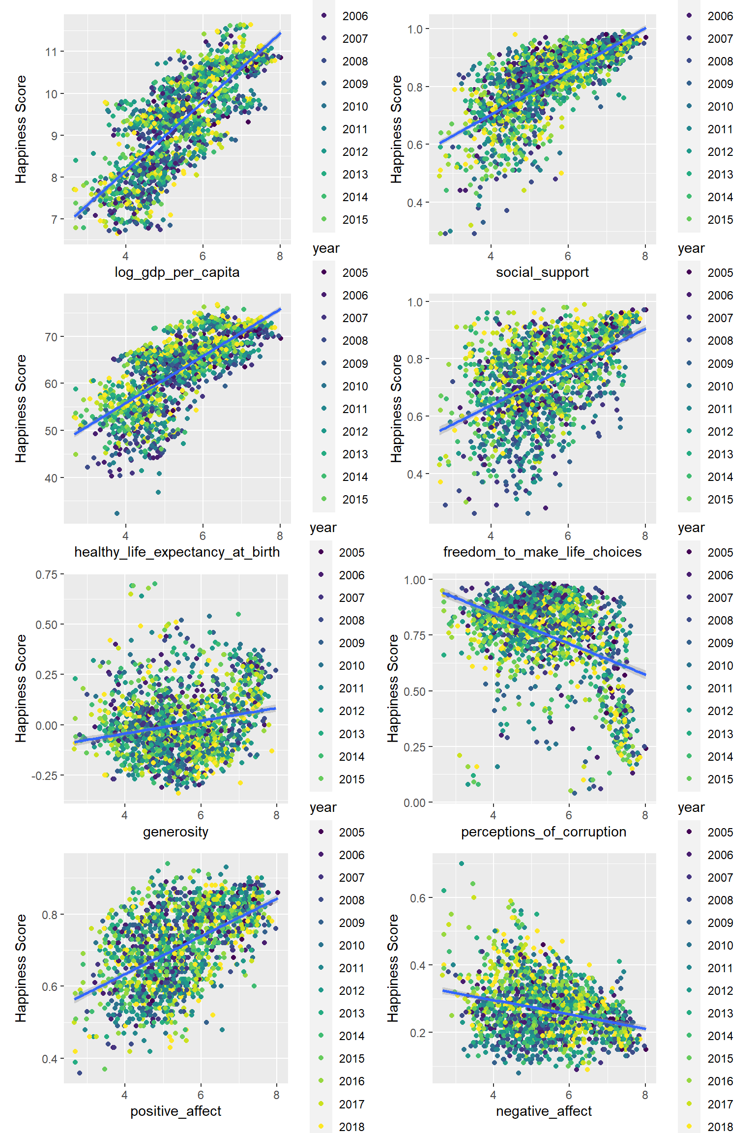
As we can see in the plots, all the factors are related to the happiness score. People would feel happy if the country they live in have high GDP, strong social support, and they could be free to make life choices, also the country is generous and offering positive affect. On the contrary, if a country has a corrupt government, people wouldn’t be happy.
Statistical Analysis
To identify the significance of relationships and establish a regression model to predict the happiness score, we first take a look on the distribution of each variable.
par(mfrow= c(3,3))
for (n in 4:ncol(happy_df)){
  var = names(happy_df)[n] %>%
    str_replace_all("_"," ") %>%
    str_to_title()
  pull(happy_df,n) %>%
    hist(main=NA,xlab=var)
}
mtext("Variable Distribution", side = 3, line = -2, outer = TRUE)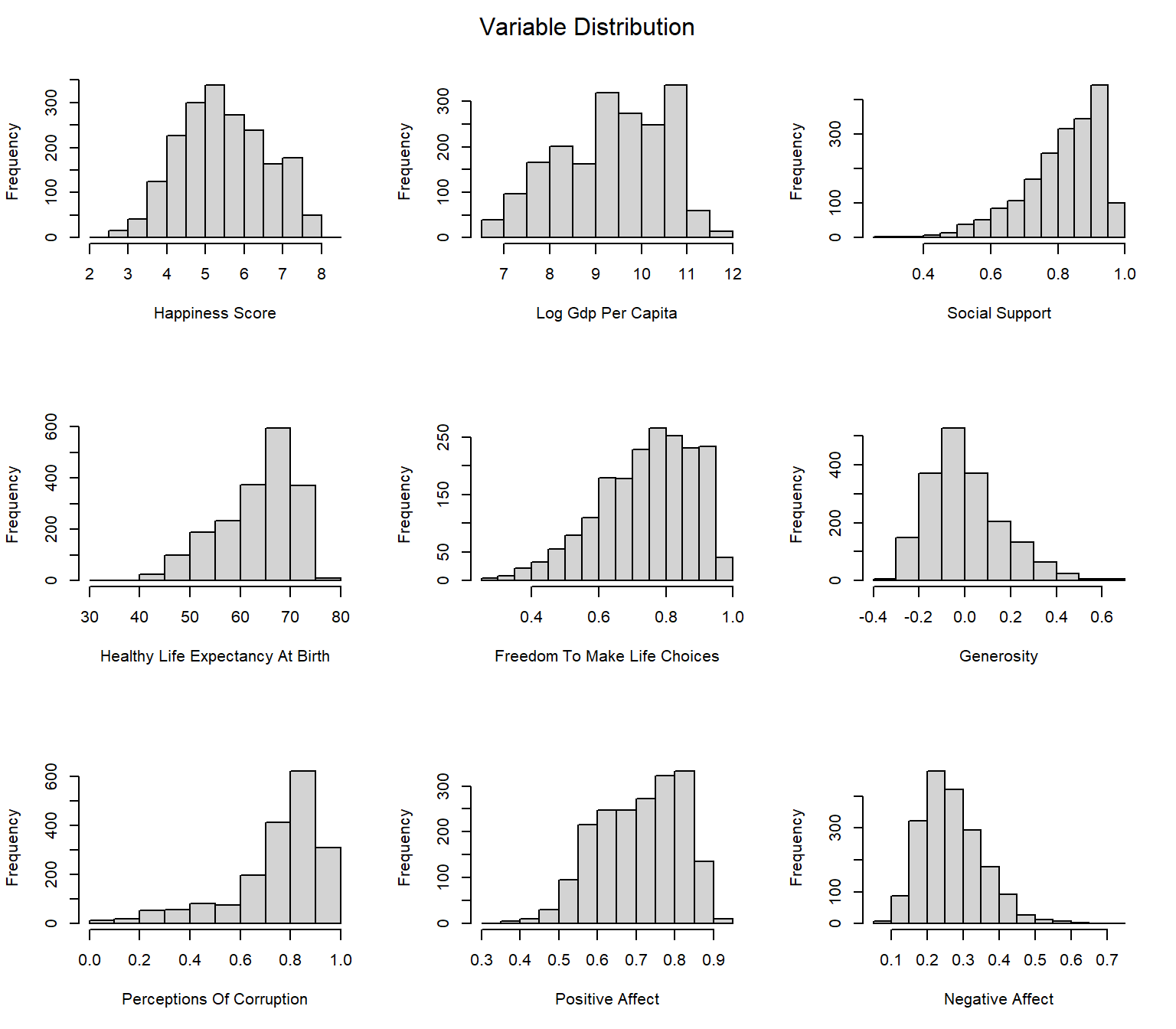
Here our happiness score follows great bell shape and is relatively non-skewed. Most of the factors are normally distributed. Therefore we can proceed to build regression model.
Linear Regression Model
Since all factors are continuous, we can apply fundamental multivariable linear regression (MLR) here.
# General Model
happy_fit = happy_df %>%
  select(-country_name,-year)
fit = happy_fit %>%
  lm(happiness_score~., data=.)
fit_est = fit %>%
  broom.mixed::tidy() %>%
  mutate(
    term = str_replace_all(term,"_"," "),
    term = str_to_title(term))

knitr::kable(fit_est)| term | estimate | std.error | statistic | p.value |
|---|---|---|---|---|
| (Intercept) | -1.2607205 | 0.2185409 | -5.7688087 | 0.0000000 |
| Country Continentamericas | 0.5552217 | 0.0535894 | 10.3606533 | 0.0000000 |
| Country Continentasia | 0.0005327 | 0.0472269 | 0.0112803 | 0.9910012 |
| Country Continenteurope | 0.2581274 | 0.0576629 | 4.4764934 | 0.0000081 |
| Country Continentoceania | 0.4165533 | 0.1194640 | 3.4868528 | 0.0005012 |
| Log Gdp Per Capita | 0.4057188 | 0.0255675 | 15.8685057 | 0.0000000 |
| Social Support | 1.3736838 | 0.1729572 | 7.9423338 | 0.0000000 |
| Healthy Life Expectancy At Birth | 0.0168519 | 0.0037904 | 4.4458942 | 0.0000093 |
| Freedom To Make Life Choices | 0.6094136 | 0.1262333 | 4.8276780 | 0.0000015 |
| Generosity | 0.6363523 | 0.0951374 | 6.6887736 | 0.0000000 |
| Perceptions Of Corruption | -0.7141108 | 0.0870452 | -8.2039130 | 0.0000000 |
| Positive Affect | 1.0566926 | 0.1944089 | 5.4354130 | 0.0000001 |
| Negative Affect | -0.3674351 | 0.1861197 | -1.9741866 | 0.0485227 |
The result indicated that Country Continentamericas, Country Continenteurope, Country Continentoceania, Log Gdp Per Capita, Social Support, Healthy Life Expectancy At Birth, Freedom To Make Life Choices, Generosity, Perceptions Of Corruption, Positive Affect, Negative Affect are all significantly correlated with happiness score, while Country Continentasia does not.
Cross Validation
To test the model efficiency and its predictory ability, we apply 100 times of cross validation and calculate the mean value of root mean squared errors (RMSE) over 100 CVs.
set.seed(1)

cv_df = crossv_mc(happy_fit, 100) %>%
  mutate(
    train = map(train,as_tibble),
    test = map(test, as_tibble)) %>%
  mutate(
    linear_mod = map(train, ~lm(happiness_score ~ ., data = .x)) ) %>%
  mutate(
    rmse_linear = map2_dbl(linear_mod, test, ~rmse(model = .x, data = .y)) )
ggplot(cv_df,aes(x="linear",y=rmse_linear)) +
geom_violin(fill="lightblue",alpha=0.7) +
labs(x = NULL, y = "RMSE",title = "RMSE of Linear Model Cross-Validation")+
theme_bw()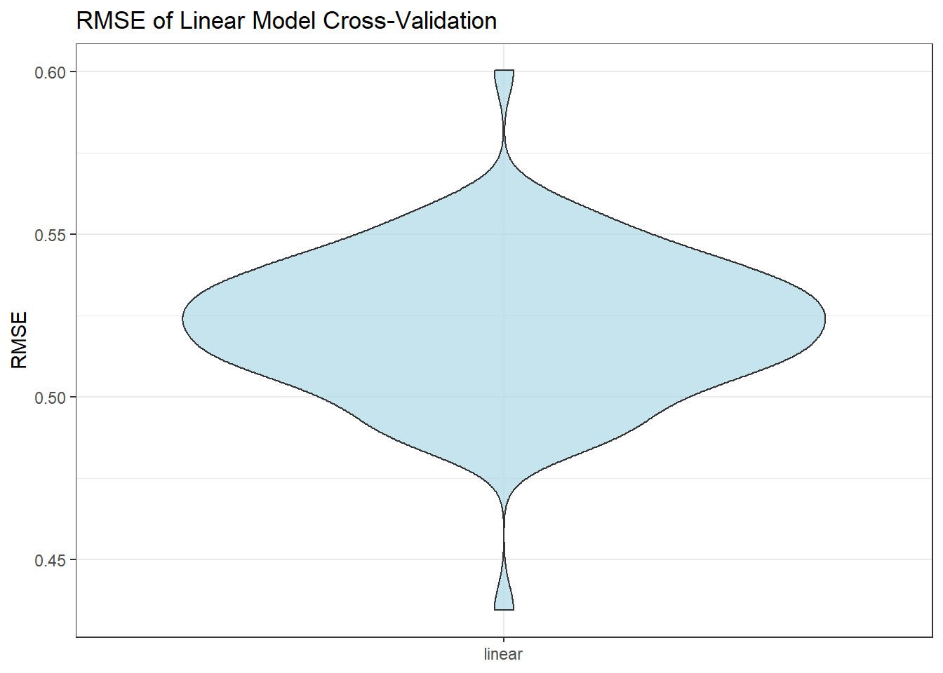
mean_rmse = mean(pull(cv_df,rmse_linear))Here we can see the mean RMSE is 0.5217449, which is acceptable. Therefore, the model could be used to predict the country’s happiness score.
Conclusions and Discussion
The outcome of the project suggests that happiness has positive associations with GDP per capita in purchasing power parity, social support, healthy life expectancy at birth, national average freedom to make life choices, generosity, positive affect measures (happiness, laugh, and enjoyment), while happiness has negative associations with negative affect measures (worry, sadness and anger) and national corruption.
In order to let more people feel happier, governments could surge the development of economics, provide more jobs, and increase the GDP per capita in purchasing power parity. Governments could also invest more in scientific, medical, and health industries so that the life expectancy of human beings has the potential to increase. governments should provide more social support to people in need and provide residents more freedom to make their own choices. When residents have more happiness, they are able to work more effectively, have a more stable social life, and overall surge the development.
Next Steps
To advance the project, it would be necessary to consider more factors and more importantly to obtain more data. Factors that could affect the happiness of nations include but are not limited to income fluctuations, marital status modifications, educational level, self-esteem, and optimism. Additionally, it would be beneficial if more data in 2019 and 2021 could be collected. These data could help us gain a better view of happiness fluctuation during COVID-19 so that we could analyze how happiness was affected by COVID-19.