Happiness score and related factors
Yunlin Zhou
12/9/2021
First sight on factors & happiness score
To better explore the relationship between happiness score and every factor, we made the linear regression plots and calculated related estimates. Further, we analyzed the result and derived to a more direct and accurate conclusion.
# Data Preparation
round2 = function(x){
  if(is.numeric(x))
  x= round(x, digits = 2)
  return(x)}

happy_df_fac = readxl::read_xls('DataPanelWHR2021C2.xls') %>%
  janitor::clean_names() %>%
  filter(year < 2019) %>%
  map_dfc(round2) %>%
  mutate(year = as.character(year)) %>%
  rename("happiness_score"= life_ladder)


# Graphic function
gg_factor = function(A,B,name){
  name = name %>%
    str_replace_all("_"," ") %>%
    str_to_title()

  ggplot(happy_df_fac, aes(x = A, y = B))+
    geom_point(aes(color = year)) +
    geom_smooth(method = "lm") +
    labs(
    x = name,
    y = "Happiness Score",
  )
}
# Plot
gg_log = gg_factor(A=happy_df_fac$happiness_score,B =happy_df_fac$log_gdp_per_capita, name = "log_gdp_per_capita")
gg_social = gg_factor(A=happy_df_fac$happiness_score,B =happy_df_fac$social_support, name = "social_support")
gg_healthy = gg_factor(A=happy_df_fac$happiness_score,B =happy_df_fac$healthy_life_expectancy_at_birth, name = "healthy_life_expectancy_at_birth")
gg_freedom = gg_factor(A=happy_df_fac$happiness_score,B =happy_df_fac$freedom_to_make_life_choices, name = "freedom_to_make_life_choices")
gg_generosity = gg_factor(A=happy_df_fac$happiness_score,B =happy_df_fac$generosity, name = "generosity")
gg_perceptions = gg_factor(A=happy_df_fac$happiness_score,B =happy_df_fac$perceptions_of_corruption, name = "perceptions_of_corruption")
gg_positive = gg_factor(A=happy_df_fac$happiness_score,B =happy_df_fac$positive_affect, name = "positive_affect")
gg_negative = gg_factor(A=happy_df_fac$happiness_score,B =happy_df_fac$negative_affect, name = "negative_affect")
library(patchwork)
(gg_log + gg_social+ gg_healthy + gg_freedom)/(gg_generosity + gg_perceptions+ gg_positive + gg_negative)+
plot_layout(guides = "collect") +
plot_annotation(title = "First sight on factors & happiness score") &
theme(
legend.position = "bottom")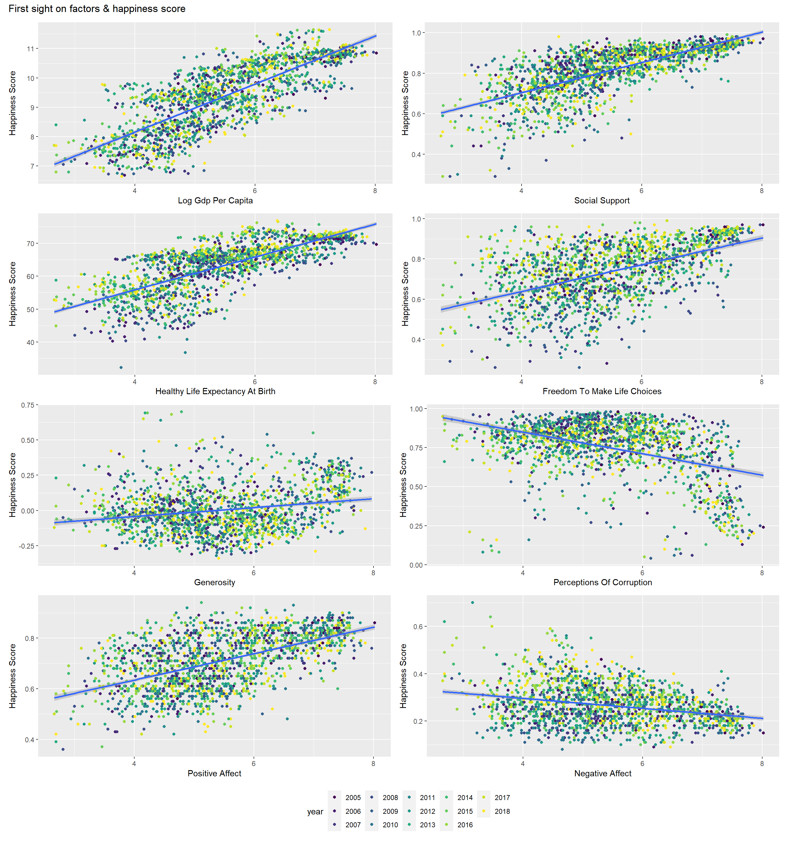
As we can see in the plots, all the factors are related to the happiness score. People would feel happy if the country they live in have high GDP, strong social support, and they could be free to make life choices, also the country is generous and offering positive affect. On the contrary, if a country has a corrupt government, people wouldn’t be happy.
Plots of Factors and Happiness score
plot_happy = function(A,B,name){
    name = name %>%
    str_replace_all("_"," ") %>%
    str_to_title()

happy_B = bind_cols(A=A,B=B,country_name = happy_df_fac$country_name,
                    year = happy_df_fac$year) %>%
  filter(!is.na(A)) %>%
  filter(!is.na(B)) %>%
  arrange(B) %>%
  mutate(
  text_label =
  str_c("Happiness score: ", A,
        "\n",name,": ", B,
         "\nCountry: ", country_name,
         "\nYear: ", year))

fit_B = lm(A ~ B, data = happy_B)

happy_B%>%
  plot_ly(
    x = ~B,
    y = ~A,
    type = "scatter",
    mode = "markers",
    color = ~year,
    text = ~text_label,
    alpha = 0.5,
    colors = "viridis") %>%
  add_lines(x = ~B, y = predict(fit_B), color = I("red")) %>%
  layout(
    xaxis = list(title = name), yaxis = list(title = "Happiness score")
  )

}
The relationship between GDP and Happiness score
plot_log = plot_happy(A=happy_df_fac$happiness_score,B =happy_df_fac$log_gdp_per_capita, name = "log_gdp_per_capita")
plot_log
log_lm_df = lm(happiness_score ~ log_gdp_per_capita, data = happy_df_fac)
summ(log_lm_df)%>%
tidy() %>%
knitr::kable()| term | estimate | std.error | statistic | p.value |
|---|---|---|---|---|
| (Intercept) | -1.6662835 | 0.1356184 | -12.28656 | 0 |
| log_gdp_per_capita | 0.7614067 | 0.0144097 | 52.83987 | 0 |
As shown in the plot, high GDP has a positive effect on the happiness score. We can see from the table that the p-value equals to 0, which suggests that changes in the GDP are associated with changes in the happiness score.
The relationship between Healthy life expectancy at birth and Happiness score
plot_healthy = plot_happy(A=happy_df_fac$happiness_score,B =happy_df_fac$healthy_life_expectancy_at_birth, name = "healthy_life_expectancy_at_birth")
plot_healthy
healthy_lm_df = lm(happiness_score ~ healthy_life_expectancy_at_birth , data = happy_df_fac)
summ(healthy_lm_df)%>%
tidy() %>%
knitr::kable()| term | estimate | std.error | statistic | p.value |
|---|---|---|---|---|
| (Intercept) | -1.5362670 | 0.155503 | -9.87934 | 0 |
| healthy_life_expectancy_at_birth | 0.1106387 | 0.002450 | 45.15819 | 0 |
As shown in the plot, good healthy life expectancy at birth has a positive effect on the happiness score. We can see from the table that the p-value equals to 0, which suggests that changes in the healthy life expectancy are associated with changes in the happiness score.
The relationship between Freedom to make life choices and Happiness score
| term | estimate | std.error | statistic | p.value |
|---|---|---|---|---|
| (Intercept) | 2.460028 | 0.1216075 | 20.22924 | 0 |
| freedom_to_make_life_choices | 4.056647 | 0.1625948 | 24.94942 | 0 |
As shown in the plot, if the people are free to make life choices, they are tending to be happy. The p-value equals to 0. We can see in the plot that the dots are widely distributed on both sides around the fitting line, which suggests that the relationship between variables is weak.
The relationship between Generosity and Happiness score
plot_generosity = plot_happy(A=happy_df_fac$happiness_score,B =happy_df_fac$generosity, name = "generosity")
plot_generosity
generosity_lm_df = lm(happiness_score ~ generosity , data = happy_df_fac)
summ(generosity_lm_df)%>%
tidy() %>%
knitr::kable()| term | estimate | std.error | statistic | p.value |
|---|---|---|---|---|
| (Intercept) | 5.418634 | 0.026992 | 200.749868 | 0 |
| generosity | 1.472421 | 0.164444 | 8.953933 | 0 |
As shown in the plot, if the country is generous to the people, the people are tending to be happy. The p-value equals to 0. We can see in the plot that the dots are also widely distributed on both sides around the fitting line, which suggests that the relationship between variables is weak.
The relationship between Corruption and Happiness score
plot_perceptions = plot_happy(A=happy_df_fac$happiness_score,B =happy_df_fac$perceptions_of_corruption, name = "perceptions_of_corruption")
plot_perceptions
perceptions_lm_df = lm(happiness_score ~ perceptions_of_corruption , data = happy_df_fac)
summ(perceptions_lm_df)%>%
tidy() %>%
knitr::kable()| term | estimate | std.error | statistic | p.value |
|---|---|---|---|---|
| (Intercept) | 7.345760 | 0.1064877 | 68.98225 | 0 |
| perceptions_of_corruption | -2.558357 | 0.1375869 | -18.59448 | 0 |
Corruption has a clear negative affect on the happiness score. As we can see in the plot, most dots are concentrating on the right side, which means many governments have high scores on corruption.
The relationship between Positive affect and Happiness score
plot_positive = plot_happy(A=happy_df_fac$happiness_score,B =happy_df_fac$positive_affect, name = "positive_affect")
plot_positive
positive_lm_df = lm(happiness_score ~ positive_affect , data = happy_df_fac)
summ(positive_lm_df)%>%
tidy() %>%
knitr::kable()| term | estimate | std.error | statistic | p.value |
|---|---|---|---|---|
| (Intercept) | 1.427094 | 0.1523521 | 9.367078 | 0 |
| positive_affect | 5.652164 | 0.2123411 | 26.618330 | 0 |
As shown in the plot, positive affect could make people feel happy. We can see from the table that the p-value equals to 0, which suggests that changes in the positive affect are associated with changes in the happiness score.
The relationship between Negative affect and Happiness score
plot_negative = plot_happy(A=happy_df_fac$happiness_score,B =happy_df_fac$negative_affect, name = "negative_affect")
plot_negative
negative_lm_df = lm(happiness_score ~ negative_affect , data = happy_df_fac)
summ(negative_lm_df)%>%
tidy() %>%
knitr::kable()| term | estimate | std.error | statistic | p.value |
|---|---|---|---|---|
| (Intercept) | 6.416557 | 0.0859855 | 74.62374 | 0 |
| negative_affect | -3.686482 | 0.3082464 | -11.95953 | 0 |
On the contrary, negative affect is leading to low happiness score. We can see from the table that the p-value equals to 0, which suggests that changes in the negative affect are associated with changes in the happiness score. Also, most dots are concentrating on the left, which means few countries are offering negative score.